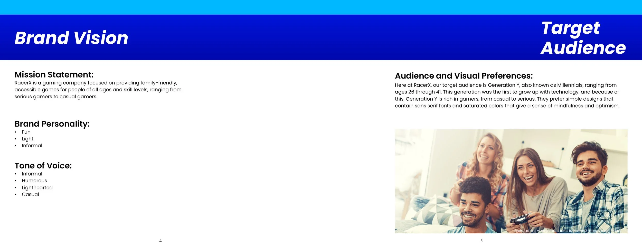
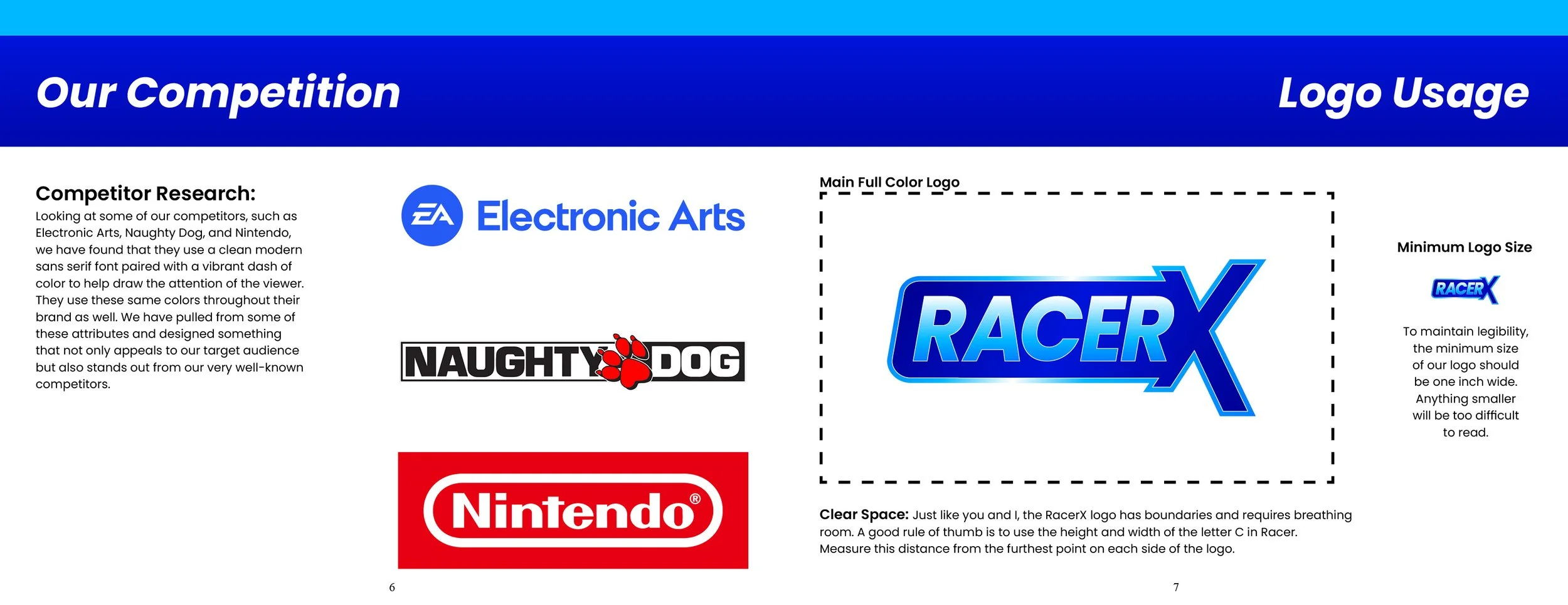
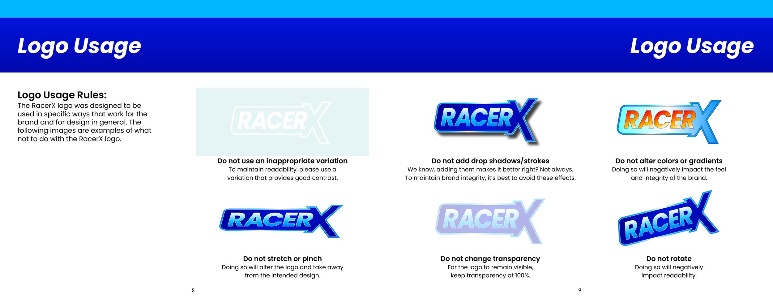
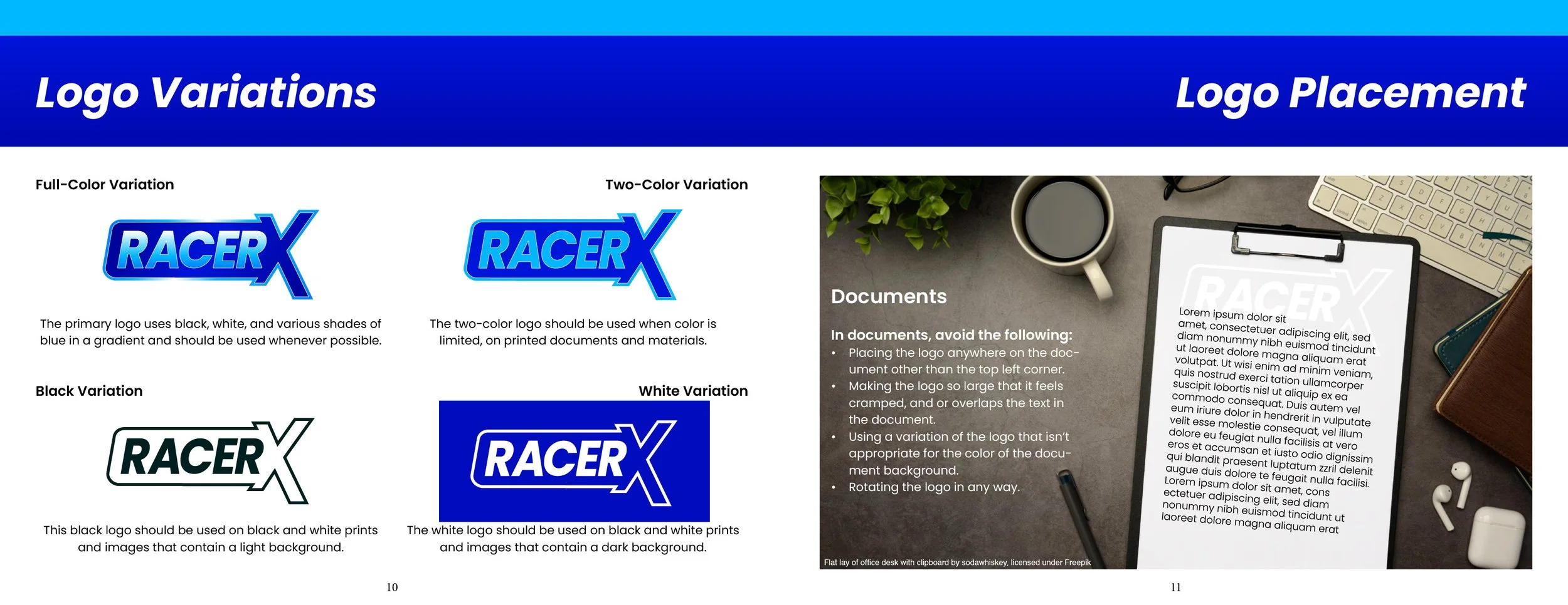
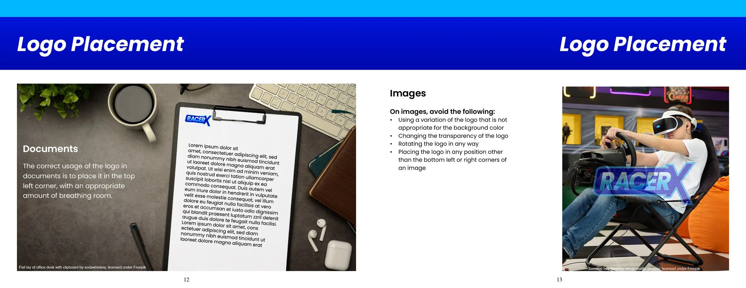
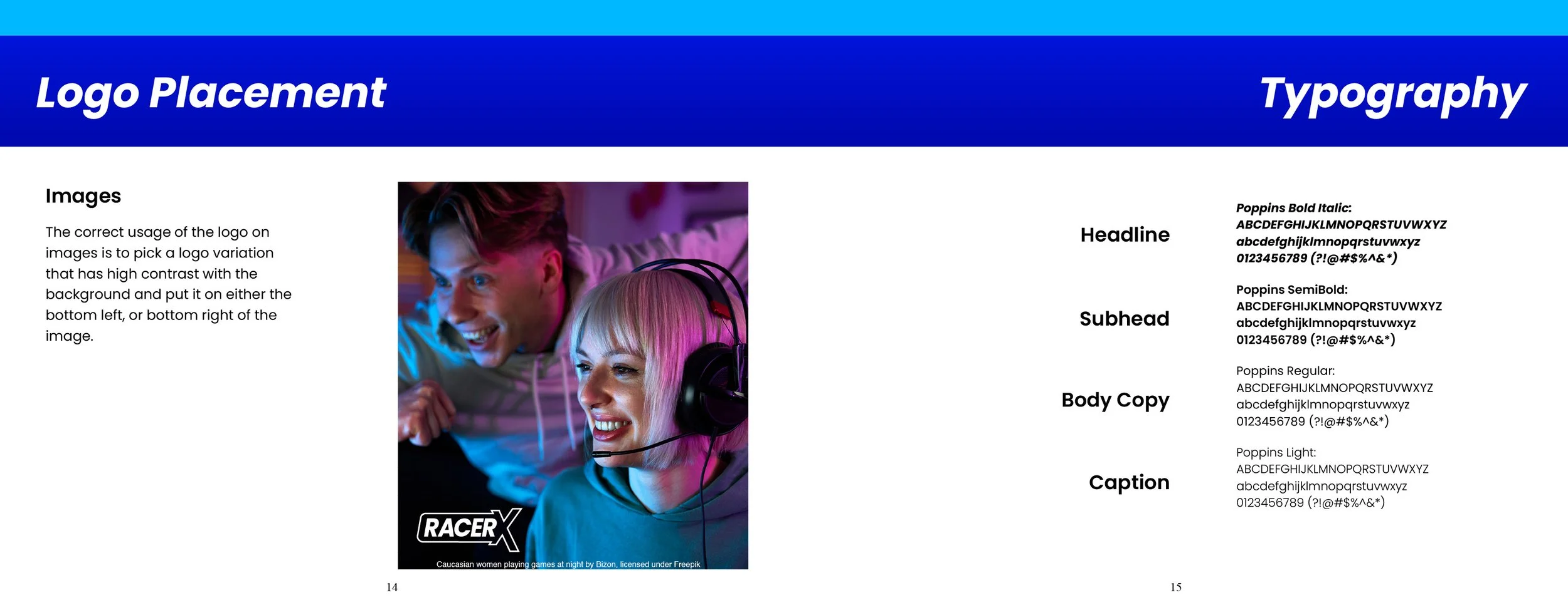
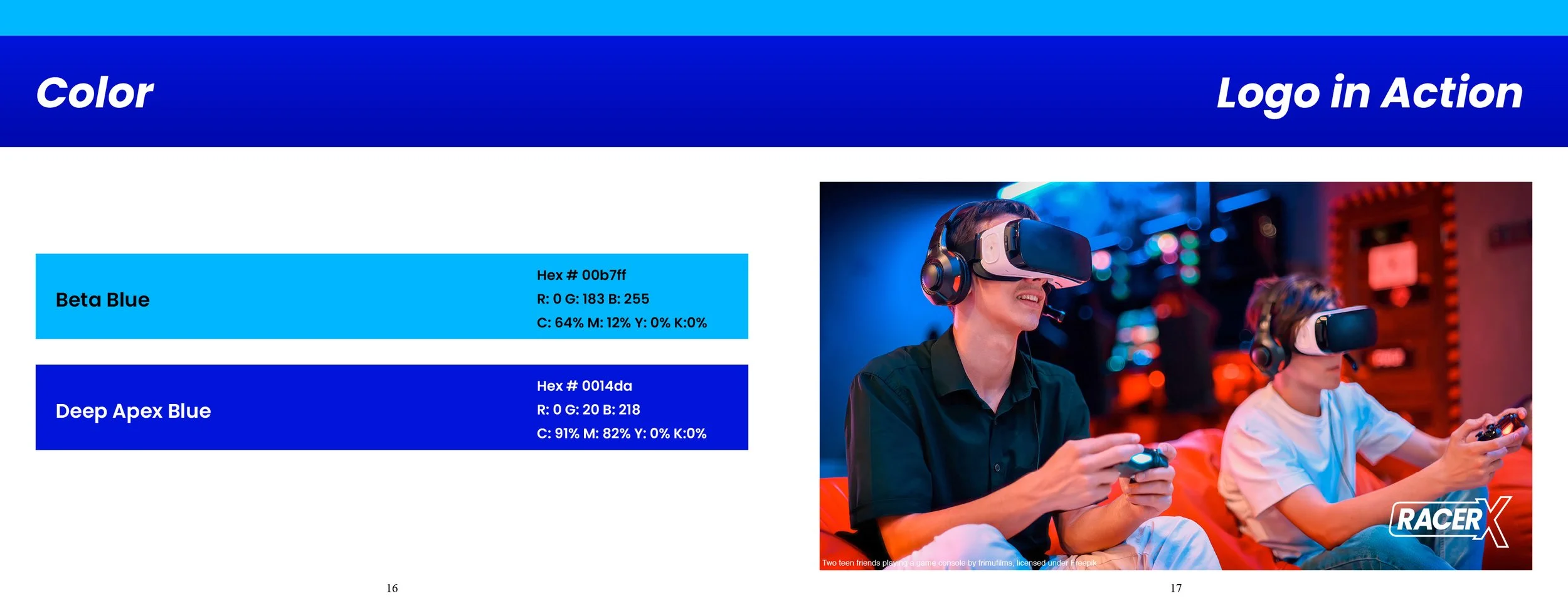
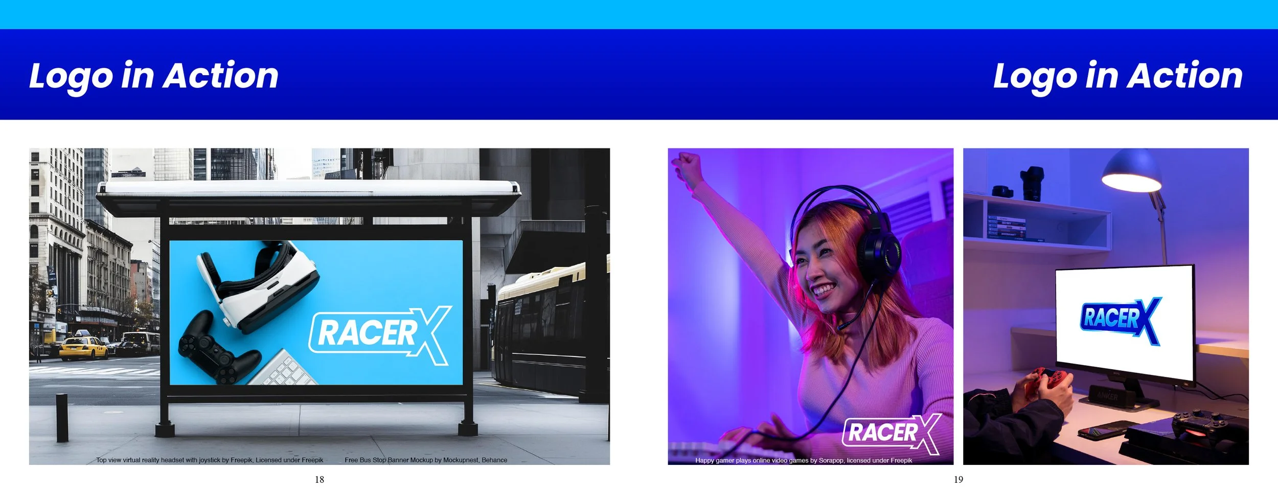
RacerX is a game developer with the goal of providing accessible, family-friendly games that everyone can enjoy, from casuals to serious gamers. Their target audience consists of millennials ranging from ages 26 through 41. They needed a logo and branding that aligned with their mission and target audience while establishing themselves as a competitor to other well-known developers. After doing some research into the competition, there were a few trends that most of them were utilizing with great success such as bold sans-serif fonts and simple color palettes that consisted of vibrant hues. In this brand identity, Poppins Bold was used with a simple two-color scheme utilizing a light blue (Beta Blue) and a dark blue (Deep Apex Blue) to add a sense of depth and to symbolize stability and trust. This brand style guide details the do’s and don’ts of the brands typography, colors, logo usage, and image usage in order to maintain the brands established presence.
RacerX